Templates & Fonts
A template is the visual personality of your book — chapter opener style, scene break ornament, default fonts, the typographic feel. You pick one in the Style tab and the preview updates immediately. Nothing about a template is permanent: change it any time, customise it as much as you like, or reset it back to defaults.
Choosing a template
Templates are grouped by genre. Click a group to expand it.
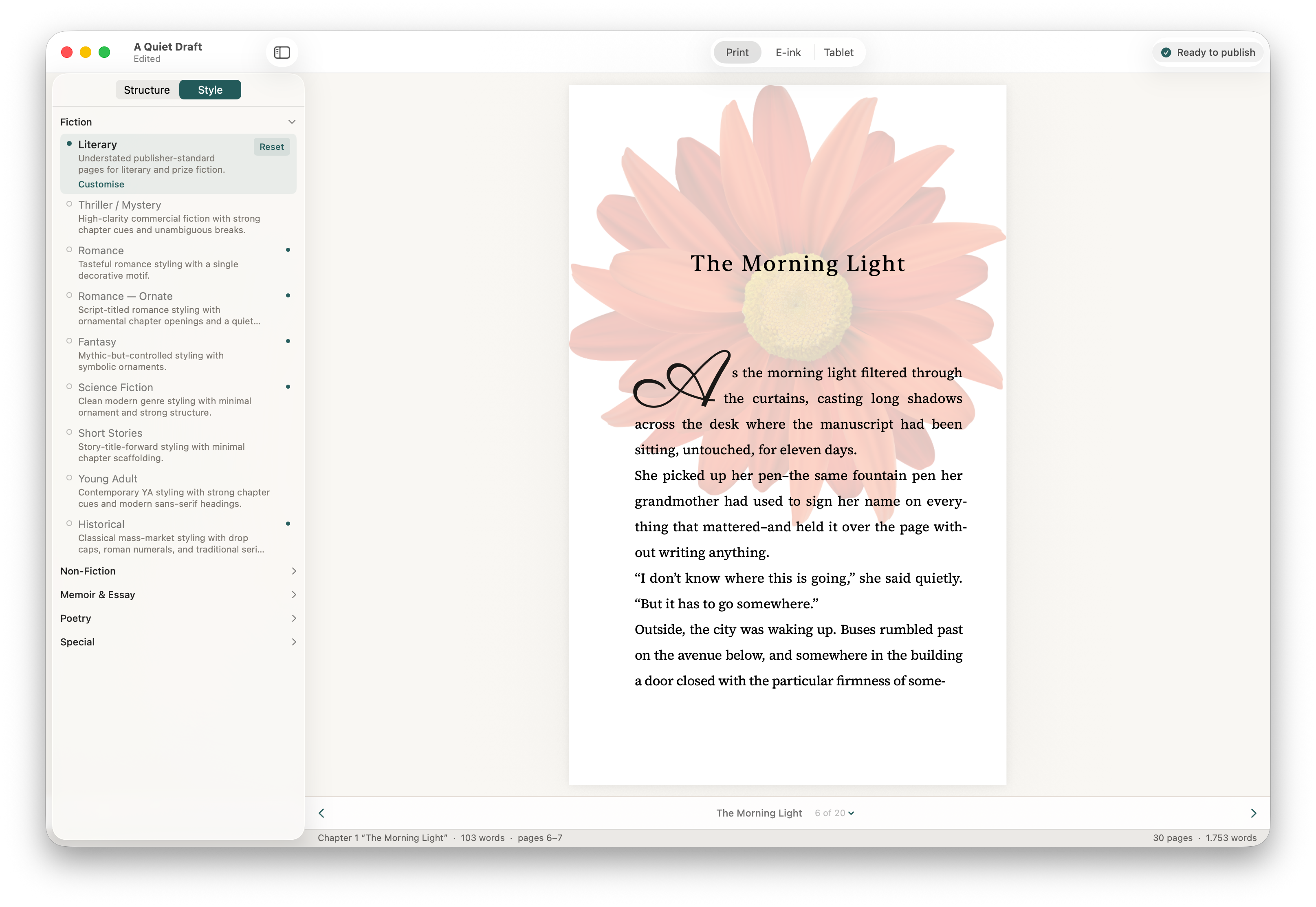
Fiction has nine templates spanning literary, thriller, romance (two flavours, restrained and ornate), fantasy, science fiction, short stories, young adult, and historical. Each one ships with chapter openers and scene breaks tuned for the genre.
Non-Fiction covers four templates for business and self-help, narrative non-fiction, academic, and practical how-to books — different relationships between chapter number and chapter title, different levels of decoration.
Memoir & Essay has three: a warm memoir template, an essay collection template, and a keepsake template for wedding, anniversary, and family books.
Poetry is a dedicated template for verse and prose poetry, with restrained chapter openers and generous whitespace.
Special has Minimalist (no decoration, pure text — works for any genre) and Classic (a traditional, slightly conservative look).
Hover over any template name in the picker for a one-line description of who it's for. There's no wrong choice — try a few and see what feels right. You can switch at any point before export.
Customising a template
Below the template picker, the Style section lets you adjust the look without switching templates. The most common things to tweak:
- Scene Breaks — the ornament between scenes within a chapter. Choose from the built-in options, or import your own SVG.
- Chapter Numbers — arabic, roman, written out as words, or hidden entirely.
- Chapter Opener — the layout of the chapter title block. Several styles range from minimal to ornate.
- First Paragraph — drop cap, small caps opening, or plain.
- Custom images — replace text scene breaks with an image, or add a chapter opener background.
When you've customised a template, a small dot appears next to its name in the picker. Click Reset to template defaults to restore the original settings. Your overrides are saved per template — switching to a different template and back preserves your customisations for each one.
Trim sizes
Trim size is the physical dimensions of your printed book. Set it in Print Settings at the bottom of the sidebar.
Stet ships with 19 trim sizes — 14 paperback, 5 hardcover — audited against KDP's current supported list. KDP-supported sizes are marked in the picker. The most common trade paperback sizes (5" × 8", 5.5" × 8.5", 6" × 9") are there, alongside mass market, US trade, royal, and the larger formats used for non-fiction and large-format hardcovers.
Stet displays measurements in inches or millimetres based on your Mac's locale. You can change the default in Stet → Settings → General.
The trim size only affects the print PDF. Ebook formats reflow to fit any screen size.
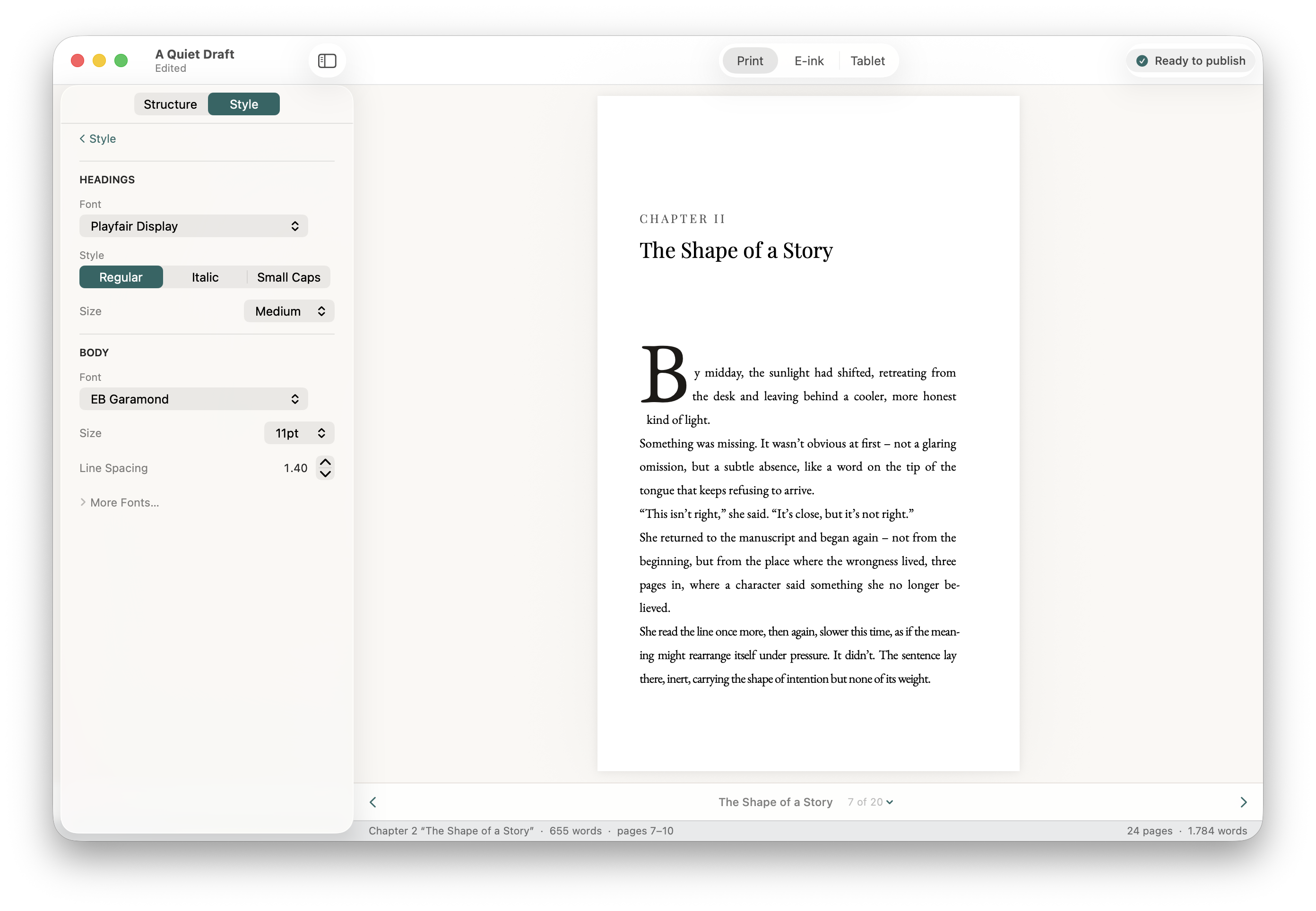
Fonts
Stet ships with a curated set of open-licence font families that are safe to embed in published files — a mix of classic serifs (EB Garamond, Cormorant, Libre Baskerville), modern serifs designed for long-form reading (Source Serif 4, Spectral), and warm contemporary faces well-suited to memoir and narrative non-fiction (Lora).
You'll find them in the picker that opens when you click the font name next to Chapter Headings or Body Text in the sidebar. Each font name in the picker is rendered in the font itself, so you can see what you're getting.
Importing your own font
If you have a font you'd rather use, expand Advanced → Import Font File at the bottom of the picker. Imported fonts are stored inside your .stet project file and travel with it.
Only use fonts you are licensed to embed in published files. Font licensing for embedding varies — check the licence that came with your font or the foundry's website.
How fonts behave in each export
Print PDFs embed the font directly, so what you see is what gets printed. EPUB files reference the font by name; most ebook readers will render with your chosen font if it's available, and fall back to a sensible default if it isn't. Kindle is the exception — it uses its own font rendering and ignores custom fonts in all ebooks, regardless of the tool used to make them. Your font choices will display correctly in Apple Books, Kobo, and most other ebook readers.